Having trouble making your sign look good? You've come to the right place!
LAYOUT
Layout is a CRUCIAL part of your design! Sign designs should always be concise and easy to read. Space is limited, so use as few words as possible to get your message across. Don’t overcomplicate your design. If a car is driving by your sign, they will only be able to catch a few words. Make those words count! For example, the design on the left has some common design mistakes. The idea that if you make everything big, it will be more visible is not exactly true! If you do not have some open space between lines, everything ends up looking quite busy and hard to read. While the example on the right uses letters that are a bit smaller, there is more open space making the design more legible and clear.

COLORS
Now, let’s talk colors! Looking back at the example on the left, the white lettering on the light blue background almost disappears. The light gray also phone number also blends in too much with the background. An easy fix for this is always use heavily contrasting colors. When one color is dark, make the other color very light and vice versa. By switching the color pallet of the example on the right, we can see how much clearer everything is. Darkening the background immediately makes the whites really stand out.
STRETCHING IMAGES
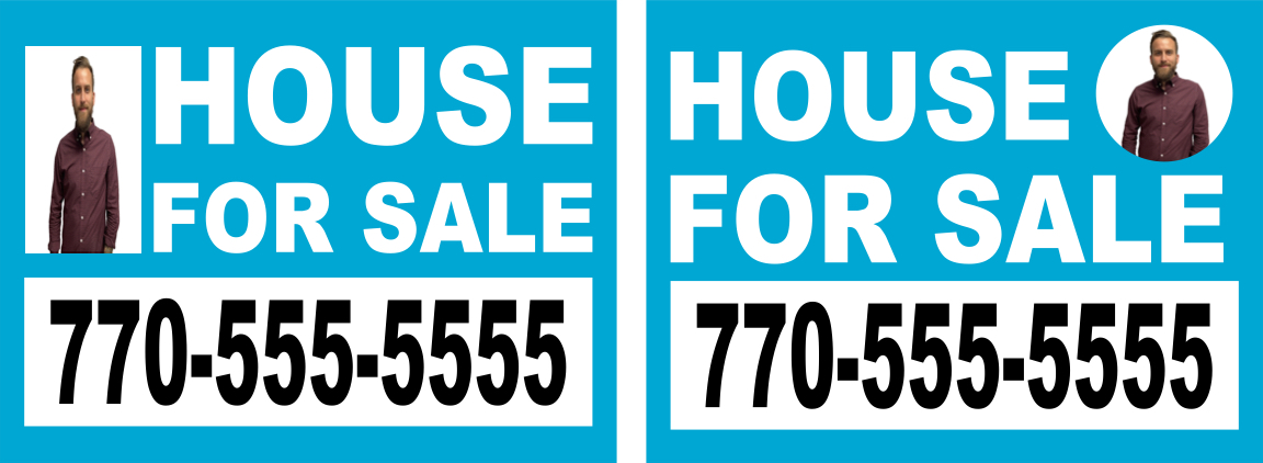
This is a big problem that we see on many designs! You've created a masterpiece! The colors are excellent and the lettering is beautiful. You add the design to your sign only to realize it does not quite fit! So you stretch the image to fill the space and end with the example on the left. The goal is to instead keep the design’s original dimensions so there is little to no stretching. The example on the right is one way to achieve this. The image has been changed to a circle instead of a rectangle, so that the original image does not have to be stretched out to fill the space. Then the text just needed a little rearranging so that the entire design remains legible and clear. In short, stretching an image should be a last resort to fill the space.

By keeping plenty of spacing in between your words, having contrasting colors and making sure images are proportionate you are on your way to having a great looking sign!
If you are still having trouble with your design, feel free to reach out to us. We have in house graphic artists ready to help. For any other comment, question or concern feel free to contact us.
Thanks for reading! :)


